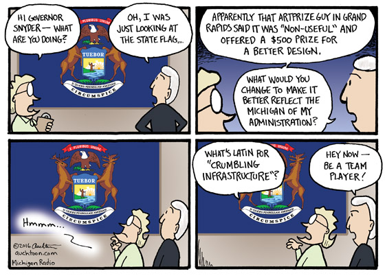
State Flag of Michigan Redesign
Last month, Rick DeVos complained aloud via Twitter that the state flag of Michigan was “ugly” and “non-useful.” Well, sharing needlessly judgmental observations is what Twitter is for, so we likely would have all moved quickly on to the next snark if DeVos wasn’t (a) the founder of ArtPrize and (b) offering $500 to the best three redesigns. At the time I was going to do a cartoon with three of my own submissions. But as is often the case, a different idea came along and overtook it. I figured this one had missed its opportunity.
However… that absolutely gorgeous, thoroughly enjoyable Independence Day weekend messed me up. I found myself happy, refreshed, and generally pleased with life, which is like kryptonite for editorial cartooning. From the void of my contentment, the flag idea resurfaced. When I realized that the winners have not yet been announced, I thought it might still have a chance.
I didn’t want to do the three submissions thing, though — that definitely seemed past its freshness date. The strongest gag idea I had was the “what’s Latin for ‘crumbling infrastructure’?” bit. (The second best: “If you seek a perilous pothole, look around you.”) With the theme established, I was inclined to bring in our Governor Snyder and have an underling take a jab at him for his abysmal performance on infrastructure issues. A quick reflection on the money my family sinks into car repair every year because of said infrastructure issues, and I was no longer happy (and therefore ready to draw).
As for the current flag — yes, it is a design mess with its mishmash of odd choices and conflicting ideas, but it also has a unique beauty. I think that’s a pretty good description of Michigan.


